


Despite industry-wide predictions and warnings, many digital marketers still focus heavily on their desktop’s conversion rate whilst leaving mobile devices as an afterthought.
Conversion rates on smartphones are growing fast. They might not have caught up with desktops just yet, but the rate of growth on desktops isn’t nearly as fast as that on smartphones.
As this graphic by small business telephone systems company Network Telecom highlights, smartphones gave a 3.05% conversion rate in Q4 last year, up from 2.86% in the previous quarter – enjoying a fourth consecutive period of increase in the UK alone.
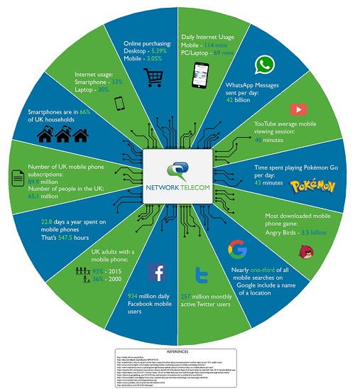
In contrast, the conversion rate on traditional devices such as desktops isn’t growing as quickly – 5.32% in Q3 up to 5.39% in Q4.
Smart Insights, who discovered those stats, have also reported that mobile traffic has overtaken desktop.
To us, this sounds as though people want to shop on their phones but often aren’t able to, because the mobile experience still isn’t good enough.
This case study from Google, for example, found that optimising a site for smaller screens resulted in a 20-30% increase in conversions.
Plus, your mobile and desktop users are usually the same people, with 90% of people using multiple screens sequentially to complete one action and 67% of people doing this to shop.
While you can add wish lists and other handy tools to make the transition between mobile and desktop smoother, why not focus on making both experiences simple enough to use by themselves?
The more your competitors start to optimise their mobile sites, the more your customers will grow impatient with yours if it doesn’t measure up.
With that in mind, here are four ways you can maximise your conversion rates by helping users complete their entire journey on the mobile device they found you through:
Navigation
Ensure you do lots of testing to ensure your mobile site makes it easy for users to find products, as this will determine how able and willing they are to add products to their basket.
For example, hamburger menus can confuse some users, whereas using the word ‘menu’ alongside your icon helps make it crystal clear as well as provides a larger area for people to press.
Also, when it comes to how you display your categories, a list view generally looks less cluttered than a grid view – but of course, this will vary from business to business, hence the need for thorough testing.
Forms
When you’re designing forms around your mobile site, like member registrations or throughout the checkout process, you want to keep in mind that for better or worse the form-filling process often has a big impact on revenue.
Space is at a premium on mobile devices, so minimise the number of fields people have to complete and make sure each element is big enough to be selected on a small screen.
It’s also a good idea to break the process down into several stages so as not to overwhelm a user, and you should always be looking to save your customer time, including showing the correct version of the keyboard they need and saving their details for next time.
Payment options
Mobile users are often making a purchase on the go – or sat on the sofa far, far away from their wallets – so making them dig around for their credit card is seen as another unnecessary obstacle to buying your products.
A huge number of people trust their financial details with alternative online payment methods such as PayPal, so get on board with these streamlined platforms and push your customers through to the “Thank You” page more quickly, more often.
Speed
While page loading speeds have come a long way on desktops, many mobile sites continue to leave users frustrated and clicking off out of impatience.
This case study, for example, found that mobile pages that are even just one second faster enjoy up to a 27% increase in conversion rate.
To speed up your mobile load times you should use a tool like Google’s PageSpeed Insights, which gives you helpful guidance on changes you can make from reducing your image file sizes to enabling caching and compression.


