Before Twitter or LinkedIn became the mainstream avenues of establishing business connections, business cards easily were the most trusted alternatives. But that doesn’t mean that even in this increasingly digital age when both the internet and paperless offices are part of our lifestyles, these business cards have gone obsolete!
You find an all-rounded professional, looking sharp and dressed to kill, and with an even more incredible-looking card. He hands you a sleek, modern-looking and tactile card, and you immediately feel tempted to close a deal with him.
What’s the secret to the effectiveness of business cards in the modern-day corporate world?
Being a mainstay of the business, business cards still have a purpose, far much greater importance than being some mere cards dished out to anyone. The secret to their persistence isn’t really about their significance, but largely the evolution in their overall design and general look.
Basically, it’s nothing other than the charm or more specifically, the mantra ‘pumped into’ the card by the graphic designer – not the paper that’s its material. With that said, here are some brilliant business card design tips sure to get your business more customers.
- Make it a real Conversation Starter
The card should be designed in such a way that it relays the right information and drives home the real meaning. The most important thing is to make it an instant conversation starter as this will help relay its intended meaning explicitly. The colours selected, font type and size, as well as the pattern, can effectively help you achieve that.
- Consider the Who; the What; the Where; the Why
It’s mandatory that you don’t convey them in a dull, trivial and unassuming way, but instead, play around with critical aspects, presenting them in a distinctive, memorable manner. The distinctiveness can be in any possible way – its colour, font type and size or even the card’s overall tone. However, go further ahead and make them look conversational.
- Take advantage of the Magic behind Colors and Patterns
It is important that your choice of colours is both conspicuous and eye-catching. If you’ve settled for the colours of your brand, a palette design to complement it can be the game-changer. However, if you would like to innately evoke the emotions of your target group, consider using specific patterns on top of the colours.
- But keep it Simple, Readable and Memorable
There’s no need for lots of colour-clashing and imagery, even if it’s important that you make it stand-out. Too much visual clutter makes it amateurish and an outright turn-off. However, try to keep it simple with just the anchor design by sticking to a clever, minimalistic design. As for the text and the font, keep it legible, ideally higher than the 8pt font.
- Stock Photos and Designs are boring – don’t use them
Why should you use what’s easily accessible on the internet to design a card that’s supposed to look uniquely cute and killer?
The tragedy with the freely available business card designs is that they tend to attract the lazy lovers of freebies. You should, instead, invest in premium-quality alternatives like what’s with Catdi Postcard Printing, or anything that clients will instantly fall in love with!
- Experiment with unusual, acceptable materials
It’s very common for it to be printed on card stock; after all, that’s what off-the-street designers love. But you can imagine how lovely the same card would look and how many people will jostle for a piece if you were to think outside the box and choose a more eccentric alternative.
For some inspiration, head over to Pinterest and sample those from transparent plastic, wood or even any other solid material. Business cards carry more value and there are no rules on which type of material to strictly use; so don’t fear to experiment on unpopular, acceptable materials.
- Include a clear, familiar photo of yourself
Owing to the increasing cases of fictitious businesses, scammers and shameless copycats, it would be wise to also include a photo of yourself on the card. Yes, it is your business card, but the need for some form of personification humanizes the card, giving it a subtle touch of individuality.
So, take one of your best photos and have it printed right on the face of the card. This way, you’ll be more likely to compel strangers to reach out to you.
- On legibility, do not scrimp
Unless your clients are calligraphers, there will be no reason to go for script fonts on your business card. Remember, much as it should look fancy, the wording should be visible, discernible, and understandable when glanced from afar. Therefore, make sure that the name and contact details are clear to see, attractive, and perhaps shiny.
- Go free with your unconventional styles
Just because it’s a business card doesn’t mean it agrees to the ordinarily universal 55x88mm palette. The main idea here is to choose a particular tool that would make your card a regularly used piece. You can go for something that looks like a key-holder, a potato chipper or even a poster-style business card. However, be as original in your designs as possible.
- Don’t forget to highlight the social media handles of your business
Social media is at the heart of the corporate world today and it would be a huge miss if you forget this critical factor on the business card of your company. Make sure you clearly indicate the names of your business on Facebook, Twitter, Instagram or whether they can WhatsApp you. It’s trendy nowadays to also include a scannable QR code that leads to your social media page.
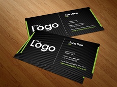
- About the Card’s backside?
Do not dedicate all your energies to the front part of it, even when the rear side isn’t any different – make it look professional, but minimalistic as well. You can use it to share vital information, especially if the front end had captured the company name, logo, and contact details.
- You can also incorporate Negative Space
If it’s absolutely impossible not to end up with a card, cluttered with lots of information, be clever and use the idea of a black-white space to ensure that it still stands out.
In all you do, don’t forget to double-check your work for clarity. It should be perfectly appealing, error-free and just the right piece that would make your clients accept it with a smile. You should not hesitate to hire a professional graphic designer who is conversant with all these and the other business card design tips.
Related posts: