Every brand needs a distinctive logo and the design work involved can be complex. A logo needs to somehow visually encapsulate the ethos and values of the brand it defines. It needs to be recognisable and distinct – in a world packed with logos. It needs to resonate with the target audience. And it also needs to work on a practical level, with print and digital reproduction.
Marketing teams often start the process of a new logo design, whether for a product, service, or campaign, by seeking inspiration from some of the other well-known logos from around the world. Let’s take a look at some of the best.
Nike

The Nike swoosh logo is named after a famous winged Greek goddess and it was designed in the golden age of logo design – the seventies. The goddess Nike inspired sporting victors, who would say ‘Nike’ to each other when they succeeded in their goals. This sense of achievement and mastery is combined with the graphical ‘swoosh’, which describes the sound of speed. Winning and speed; two key values of one of the world’s most renowned brands.
Target
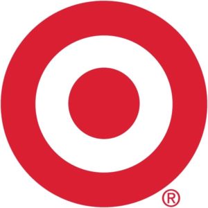
This famous US brand logo was created in 1962 and it has evolved from the original three red rings containing the company name to a simple graphical target device. The text has been removed and the red denotes passion. Circles are there to describe community and trust and the negative surrounding space is there to create strength.
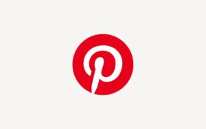
Designed in 2010 when the online inspiration ‘board’ opened, the Pinterest logo uses a graphical ‘p’ device that represents a pin on a board. The red colour is chosen to represent energy, creativity and passion and the swirly typeface has been chosen for its creativity and artistry; two principles that are core to Pinterest’s legion of lifestyle users.
North Face
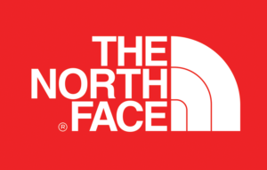
The North Face logo was designed in 1971 and the colours were chosen to represent key values of bravery, passion, trust and adventure. The North Face logo itself refers to mountain climbing and the logo shape references Yosemite National Park’s graphite ‘half dome’. The simple graphic also conveys a sense of adventure and possibility and it works extremely well on print and digital mediums, even when rendered in a small size.

Designed originally in 1998, Google always had a typographic logo solution and began with a standard font until 2009, when it chose a new typeface, shading and colour. A few adjustments to letter spacing were made in 2014, demonstrating how even small changes can impact on brand recognition. The logo today has a modern and customised font with highly saturated and vibrant colours.
The simplicity of the solution is there to demonstrate accessibility to all and the colours help the company name to ‘pop’. By choosing a secondary colour; the ‘i’ in green, the company showed that it was innovating and not following rigid design rules. Negative space demonstrates a ‘standing apart’ from the masses. Google is also unusual in creating campaign and event-led versions of its logo for worldwide events – again, breaking the rules!
FedEx
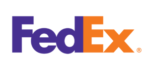
Sharp, precise and active, FedEx created its first logo in 1973 and added the white arrow of today’s version in 1994. The arrow was chosen to suggest those very traits that a delivery company needed to encapsulate. The choice of colours again is designed to pop and be eye-catching, but the orange and purple palette is adjusted for different parts of the business, to help with recognition.
Apple
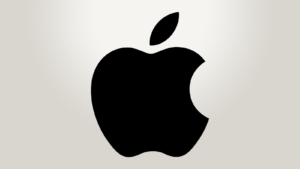
Created in 1976, the first Apple company logo literally featured Newton sitting under the famous tree! But the artistry was soon replaced by a simple and literal apple graphic. It was first a rainbow coloured graphical device to symbolise the first colour display computer screen – and then it evolved into chrome and then today’s flat colour version. It’s sleek, accessible to all and sophisticated, with the curve of the apple showing style. The bite from the apple itself? Some suggest it denotes a bite from the apple of knowledge in the Garden of Eden. Others think it’s a play on the computer ‘byte’. Either way, the simplicity of the design means that everyone recognises it.
Baskin Robbins
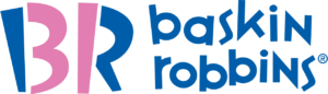
In a world of simple tech logos, it’s fun to see a Baskin-Robbins brand identity which is designed to celebrate energy and fun. The new 31 number is still shown to represent a hint of an ice-cream scoop, and the pink ice-cream captures the brand’s initials. The colours are designed to be fun, universal, warm and friendly and the slightly retro look celebrates the 60-year heritage of the company.
So, the next time you’re considering a rebrand, take inspiration from the world’s finest and help them to lead your creative thinking.
Related posts: