Human beings and machines create trillions of pieces of data a day. In today’s digital world, data is the reigning king that powers everything from sales to views on YouTube. That being said, it’s getting harder and harder to make sense of that data. In the early 2000s, business owners and marketing managers lived by “I have a ton of data, so I will be ahead of the competition”. However, very few people knew how to utilize that data.
In 2020 and beyond, it will become even more important to understand how to use the big data our company creates (and is supplied). The key to this is understanding data visualization.
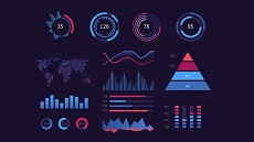
What is data visualization?
The simplest form of data visualization is the pie graph. By elementary school, nearly everyone is subjected to a pie chart. By high school, the Ven diagram. These two examples are the simplest forms of data visualization.
There are dozens of types of data charts. Some are more useful than others for business owners and marketing managers. Here are the 3 most effective types of data visualization used in business.
- Column Chart
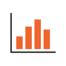
The column chart is another one of those carts that you’ve likely experienced throughout your schooling. In the business world, they are commonly used to display sales goals, numbers, or projections.
- Bar Graph
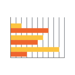
Often confused for a column chart, the bar graph is a good way to work with longer variables, communicate negative numbers, and view large data sets. Unlike the column chart, a bar graph does not prevent you from displaying data sets due to labeling.
To add to this, the stacked bar graph is incredibly popular amongst agencies with varied ranges within their data sets. For example, you may want to track 4 different organic traffic strategies by their keyword rankings. With a stacked bar graph, you can display the growth of data sets within ‘parent groups’ easily.
- Line Graph
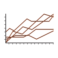
The line graph is the preferred graph for trend line lovers. This data visualization is best used to show changes over time. Some will use it in finances, though many find it’s a good way to track revenue, traffic, or timed campaigns. Try to limit your lines to 4. If you find yourself needing more, you may need to turn to another form of graph to display the graph clearly.
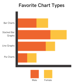
Choosing the Right Graph
To prevent confusion, make sure you carefully analyze the data you’re trying to communicate with others. Some charts will be more useful than others. For example, if you’re wanting to show a trend line choose a type of axis chart that can illustrate the trend line easily to executives. To keep it clean, consider the different variables you need to include in your presentation.
Using Data is As Important as Having It
If you work in an office or agency, chances are you’re already submerged in data visualization on a daily basis. During reports, conference calls, and day-to-day tasks data visualization is used to make the big data that powers the average office legible to all of the employees. More importantly, these visualizations help us push important points to our team members without going through each and every number. If you’re looking to streamline any kind of data, turn to data visualization.
How do you utilize data visualization in your business or office? What areas do you think could benefit from the visualization? Share your story in the comments.
Related posts: